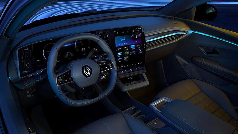
The OpenR screen in the All-new Mégane E-TECH Electric is beyond a doubt Renault’s most striking breakthrough in on-board technology in the past several years. Its glass panel and unprecedented size blend beautifully into the cockpit’s lines. The OpenR Link interface, which runs on the Android OS and features Google’s ecosystem, is as simple to use as a smartphone. And the result is clear to see: the screen is seven times smoother to use than the previous generation! Marc, Chief Designer Vision experience at Renault, takes us on a hyper-intuitive digital journey.
The first car with a touchscreen, the Buick Riviera, celebrated its 35th anniversary last year. But in-vehicle electronics have come a long way since then! The hardware is more efficient, the experience is smoother, the applications are being updated non-stop, the screens are high-resolution, and navigation is now effortless, for instance. And one thing hasn’t changed much recently: multimedia systems in vehicles are looking more and more like smartphones.
An XXL screen for full immersion
Renault has developed an electronic architecture like nothing the market has seen before, to modernise driver assistance systems and enhance viewing comfort when using them. The all-new Mégane E-TECH Electric is the first car to feature it.
From where the driver is sitting, it’s a sweeping digital display made of up two screens forming an L. The vertical 12-inch screen is on the car’s centre console. “It’s in the best position for the driver to see it and operate it easily, to take full advantage of the multimedia capabilities without taking their eyes off the road,” Marc explains. The horizontal 12.3-inch screen is built into the dashboard, behind the steering wheel.
Together, the two screens span 774 sq. cm. So they maximise the display area and provide an exclusive immersive experience. They befit a large premium saloon and are quite simply the biggest screens Renault has ever built into a vehicle.
This technical feat overlaps with the arrival of the all-new CMF-EV platform for electric vehicles. Thanks to it, the engineers were for instance able to move the air-conditioning unit into the motor compartment and free up more space in the cockpit. This made it possible to pare back the centre console and add the flush screen. They have also transferred the gear stick and MULTI-SENSE interface to the steering wheel, to improve the ergonomics and open up more space in the middle of the passenger compartment and on the centre console.
At a time when car manufacturers are shifting everything they can onto screens, Renault has taken a more subtle approach: “We kept the buttons beneath the central screen. That way, the important ones, like the air conditioning settings, still use a ‘physical’ interface. This line of chrome-plated buttons looks natural in the cockpit. And it avoids the ‘fake’, unused buttons beneath the console that previous vehicle generations often had.”
These unmarked buttons were options that were not included in some trims. On the Mégane E-TECH Electric, all the optional controls – such as the heated steering wheel – are operated via the screens.
A navigation experience enhanced by Google’s ecosystem
In the Mégane E-TECH Electric, the user experience is a lot like having a smartphone built into the car. “The idea is to draw inspiration from the best practices that customers are used to enjoying on their smartphone. That way they don’t have to learn to use a whole new system,” Marc adds.
Android Auto and Apple CarPlay are still available, but the interface is designed to avoid having to use a phone altogether. All the features are at users’ fingertips, and the OpenR Link system runs on the Android OS, so all the familiar apps are there. “We teamed up with one of the champions in this field, Google, so that we could tap into all its expertise. The apps include all the Google ecosystem classics, including Google Maps. If customers use Google Maps on their phone, they get the exact same experience on their car’s screen – but better. The screen is six times bigger than an average smartphone screen. It’s definitely more convenient when you’re at the wheel.”
Google Maps has also been optimised for electric cars, so it for example includes a route planner specifically for them. This planner can factor in real-time vehicle data, weather information and other variables to suggest a stop at a given charging station, tell the driver what the battery charge level will be on arrival at that charging station, and tell them how long it will take to charge the battery. It can also estimate the battery charge level when the car reaches its destination.
There’s another advantage: the maps are regularly updated, so they are becoming increasingly accurate all the time. Marc adds, “Millions of users are enriching Google’s database, to enhance it non-stop. This system is ‘alive’, it’s evolving all the time.”
This OpenR Link system is packed with 10 years of experience in on-board technology at Renault: “We kept the overall Renault Easy Link concept, but used what we were learning from our customers, too. We focused on simplification. Today, 90% of the features you need every day are only one or two clicks away. And everything is visible on the screen: there are no hidden pages.”
Cutting-edge technology: Renault teams up with experts
On the hardware side, Renault for example chose American specialist Qualcomm, which has supplied its third-generation Snapdragon Automotive Cockpit platform, built around an ultraefficient processor that has plenty of extra capacity to handle future applications.
However, the screens, computing power and system also require some form or “intelligence” behind the human-machine interface (HMI). For that, Renault approached South Korean multinational LG Electronics, which for instance developed the software platform to pair the car’s two screens, so the driver can for example display the navigation maps on the display behind the steering wheel.
Tackling challenges with bold ideas
The big question was how to blend the best multimedia services into a car cockpit without sacrificing driver convenience and comfort. And the Renault engineers and designers working on the Mégane E-TECH Electric came up with several bold ideas to find the perfect place for every part.
For example ,the air vents: finding a place for them was tricky because of the large screens. The vertical central screen, for example, prevented air from flowing properly above and below it. Moving the screen up was not an option. To work around this, i.e. keep the design flush and at the same time keep passengers comfortable, Renault built the flaps into the air vents. So, they are inconspicuous between the two screens, and they direct air flows more effectively around the passenger compartment.
There was another sizeable challenge: the steering wheel. Or rather striking the right balance between usability and compactness. The goal was to include as many buttons as possible in it, to keep the centre console as lean as possible, but without preventing the driver from seeing all the information on the dashboard screen. So the designers went for a smaller, squarer steering wheel, which is slightly flatter in the centre, to keep driving pleasurable and the dashboard screen readable.
Lastly, placing the central screen was complicated: it essentially involved fitting the largest vertical screen Renault had ever designed into an architecture that was entirely new. “It was risky from a stylistic point of view, because the dashboard screen was horizontal and the other one wasn’t,” Marc explains. He nevertheless insisted that the centre screen be vertical – which is what Renault has been doing since 2014. “It was a choice and we stuck with it. We’d done it before in Espace and Clio, and we decided to do it again with the Mégane E-TECH Electric. Because we are certain it’s the best option when it comes to clarity, especially for the driver assistance and the whole navigation system.” Why vertical and not horizontal? “When you’re navigating, you need to know what’s going on in front of you, not next to you! And, when you’re scrolling through a long list of tunes on Spotify or Deezer, the vertical screen displays more of them at a time,”Marc wraps up.


